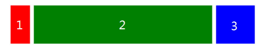
# 三栏布局
即左右模块固定宽度,中间模块随浏览器变化自适应
详解 CSS 七种三栏布局技巧 (opens new window)
# Flex
<style>
  .container {
    display: flex;
    height: 200px;
  }
  .left, .right {
    width: 200px;
    background-color: red;
    height: 100%;
  }
  .main {
    background-color: yellow;
    flex: 1;
  }

</style>

<div class="container">
    <div class="main"></div> main
    <div class="left"></div>
    <div class="right"></div>
</div>
2
3
4
5
6
7
8
9
10
11
12
13
14
15
16
17
18
19
20
21
22
https://code.h5jun.com/quha/2/edit?html,css,output (opens new window)
# 绝对定位
<style>
  .container {
    position: relative;
  }
  .main {
    height: 200px;
    margin: 0 120px;
    background-color: yellow;
  }
  .left {
    position: absolute;
    width: 100px;
    height: 200px;
    left: 0;
    top: 0;
    background-color: red;
  }
  .right {
    position: absolute;
    width: 100px;
    height: 200px;
    background-color: green;
    right: 0;
    top: 0;
  }
</style>

<div class="container">
    <div class="main"></div> main
    <div class="left"></div>
    <div class="right"></div>
</div>
2
3
4
5
6
7
8
9
10
11
12
13
14
15
16
17
18
19
20
21
22
23
24
25
26
27
28
29
30
31
32
https://code.h5jun.com/qiri/edit?html,css,output (opens new window)
简单实用,并且主要内容可以优先加载。
# Float
<style>
	.left {
	    float: left;
	    height: 200px;
	    width: 100px;
	    background-color: red;
	}
	.right {
	    width: 200px;
	    height: 200px;
	    background-color: blue;
	    float: right;
	}
	.main {
	    margin-left: 120px;
	    margin-right: 220px;
	    height: 200px;
	    background-color: green;
	}
</style>

<div class="container">
   <div class="left"></div>
   <div class="right"></div>
   <div class="main"></div>
</div>
2
3
4
5
6
7
8
9
10
11
12
13
14
15
16
17
18
19
20
21
22
23
24
25
26
https://code.h5jun.com/soji/edit?html,css,output (opens new window)
左右模块各自向左右浮动,并设置中间模块的 margin 值使中间模块宽度自适应。
缺点就是主要内容无法最先加载,当页面内容较多时会影响用户体验。
因为main不能在left right 之前渲染
# BFC
<style>
	.left {
	    float: left;
	    height: 200px;
	    width: 100px;
	    background-color: red;
	}
	.right {
	    width: 100px;
	    height: 200px;
	    background-color: blue;
	    float: right;
	}
	.main {
	    overflow: hidden;
	    height: 200px;
	    background-color: green;
	}
</style>

<div class="container">
   <div class="left"></div>
   <div class="right"></div>
   <div class="main"></div>
</div>
2
3
4
5
6
7
8
9
10
11
12
13
14
15
16
17
18
19
20
21
22
23
24
25
https://code.h5jun.com/foyec/1/edit?html,css,output
主要内容模块无法最先加载,当页面中内容较多时会影响用户体验。
# 双飞翼
思路:
- 左、中、右div 左浮动
- 中div设置一个子div 并设置左右margin(=左右div宽度)
- 左div 的margin-left 设置-100%
- 右div 的margin-left :设置负的右margin
<style>
  .content {
    float: left;
    width: 100%;
  }
  .main {
    height: 200px;
    margin-left: 110px;
    margin-right: 160px;
    background-color: yellow;
  }
  .left {
    float: left;
    height: 200px;
    width: 100px;
    margin-left: -100%;
    background-color: red;
  }
  .right {
    width: 150px;
    height: 200px;
    float: right;
    margin-left: -150px;
    background-color: green;
  }
</style>
<div class="content">
  <div class="main"></div>
</div>
<div class="left"></div>
<div class="right"></div>
2
3
4
5
6
7
8
9
10
11
12
13
14
15
16
17
18
19
20
21
22
23
24
25
26
27
28
29
30
31
https://code.h5jun.com/xavug/edit?html,css,output (opens new window)
# 圣杯
思路
- 左、中、右div 左浮动
- 外div设置左右padding(=左右div宽度)
- 左div 的 margin-left 设置-100%
- 右div 的 margin-right:设置负的自身宽度
- 设置相对定位,左移
 <style>
.container {
    padding-left: 50px;
    padding-right: 60px;
}

.main {
	    float: left;
	    width: 100%;
	    height: 300px;
	    background-color: red;

}

.left {
	    float: left;
	    width: 50px;
	    height: 300px;
	    background-color: blue;
      margin-left:-100%; //向左移动main的宽度100%
      position:relative;
      right:50px; 相对自身

}

.right {
	    float: left;
	    width: 60px;
	    height: 300px;
	    background-color: green;
      margin-right:-60px; //让外界看来没有宽度

}

header {
    background: black;
}

footer {
    clear: both;
    background: black;
 }


</style>
<header>header</header>
<div class="container">
	<div class="main">main</div>
	<div class="left">left</div>
	<div class="right">right</div>
</div>
<footer>footer</footer>
2
3
4
5
6
7
8
9
10
11
12
13
14
15
16
17
18
19
20
21
22
23
24
25
26
27
28
29
30
31
32
33
34
35
36
37
38
39
40
41
42
43
44
45
46
47
48
49
50
51
52
53
https://code.h5jun.com/jocow/edit?html,css,output (opens new window)
不同在于解决”中间栏div内容不被遮挡“问题的思路不一样:
圣杯布局,为了中间div内容不被遮挡,将中间div设置了左右padding-left和padding-right后,将左右两个div用相对布局position: relative并分别配合right和left属性,以便左右两栏div移动后不遮挡中间div。
双飞翼布局,为了中间div内容不被遮挡,直接在中间div内部创建子div用于放置内容,在该子div里用margin-left和margin-right为左右两栏div留出位置。
多了1个div,少用大致4个css属性(圣杯布局中间div padding-left和padding-right这2个属性,加上左右两个div用相对布局position: relative及对应的right和left共4个属性,一共6个;而双飞翼布局子div里用margin-left和margin-right共2个属性,6-2=4),个人感觉比圣杯布局思路更直接和简洁一点。
简单说起来就是”双飞翼布局比圣杯布局多创建了一个div,但不用相对布局了